Nexomon: Part 4
Exclusive creatures await in VEWO’s first Nexomon!
Special thanks to the Nexomon Wiki for the images featured in this article.
Despite being free-to-play, the original Nexomon was a hard pass when I saw its monetization grabs. I later learned that it was released for a flat rate (with the microtransactions removed) on platforms such as Steam. But by that point, I was already deep into Extinction. Considering how rough it looks in the trailers, and how Extinction fills in the blanks for major plot points anyways, I don’t feel that I’ve missed much.
Surprisingly, many Nexomon make their first and only appearance in this game (at the time of writing, anyways). Unfortunately, the Wiki doesn’t list any flavor text, so I have to weigh them on appearances alone.
Just like last time, I’ll be rotating between Nexomon families I like and dislike.
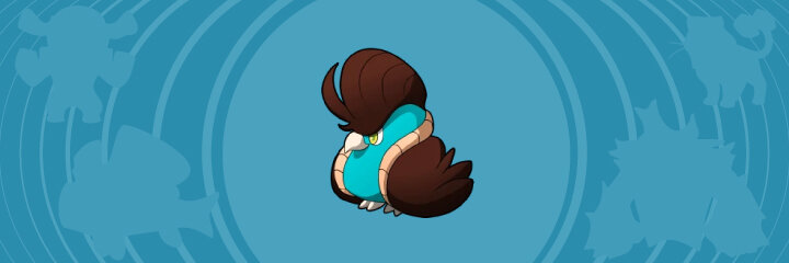
Algamaid
A shrimp mermaid is a fantastic idea! What’s better, Algamaid is a monster that mimics human characteristics, rather than explicitly looking like a manbeast. I think its design would benefit from a different shell (it looks quite generic), but it’s still visually solid overall.
Toka
Bilabeka
Aristokan
When Pokémon’s seventh generation and Toucannon released, I wasn’t sure if toucans could be drawn any more preposterous than they look in real life. Nexomon’s artists have pleasantly surprised me with their fun cartoony spin on the bird!
However, one tiny flaw is holding back their rankings: their color scheme. The problem isn’t that these Nexomon sport gaudy colors, it’s that close to #ff0000 red is a terrible design choice. It physically hurts my eyes to stare at these characters. Yo-kai Watch frequently does the same thing, and it irritates me to no end.
Frulf
Luberg
Arctivore
In a market saturated with wolf characters, it takes a lot to get over my bias against them. This Nexomon family is not one of those fortunate cases. Arctivore is a prime example of what I mean when I say “generic wolf.” Its pleasing color palette is the silver lining that escapes it from being complete “trash.”
Aulion
In contrast to Arctivore, here’s a character with simple feline anatomy that stands out with the finer details. I love the loose Egyptian cues with Aulion’s pharoah mane and “eyeshadow.” The chosen shades of yellow and turquoise pair well with its black and white body.
If there’s one critique to make, it’s my recommendation to either shorten or remove the whiskers. As they currently stand, they fight with the lines that intersect them.
Basten
Felynth
Felicient
The Egyptian theme continues, but this Bastet line isn’t as effective. I’m highly intrigued by Basten’s collar, but I find it underwhelming by the time Felicient wears it.. I’m also not a fan of the red, yellow, and green chosen for their color schemes.
Arnut
Nutchok
I’ll give credit to Nutchok for being an unexpected evolutionary turn for Arnut. That said, I can’t shake how much I dislike its design. There’s no deeper meaning behind my opinion; I just think it’s bad.
Also, pure white bandages don’t look good against a pure white body.
Blizo
Blizbrow
Blizloo
I have an aversion to apes that runs deeper than my distaste for generic wolves. But Blizloo is taking the piss out of “tough gorilla/yeti man” tropes to a degree so ridiculous, that its design circles back to entertaining. Blizloo’s awkward hairy pectorals added with its grin and pipe-shaped horns make this Nexomon all around goofy.
I like Blizloo ironically, but it’s a positive reaction nevertheless.
Cavel
Dromeruf
Moundrian
To be fair, I didn’t anticipate a cute little camel to transform into an Anime protagonist’s rival. I just can’t pinpoint whether or not it’s genius or stupid that Dromeruf and Moundrian exist. To the fence-sitting “Meh” rating I go!
Dandelloon
Dandemill
I find Dandelloon generally underwhelming, but I can see where it’s a decent character design. The little bowtie and innocent face are cute. Turning the base of a dandelion seed into a tail for the monster is a clever idea.
It’s a shame that I can’t achieve a similar analysis with Dandemill. Ignoring the fierce competition Pokémon brought with Jumpluff and Whimsicott, Dandemill is still an insult of an evolution. A couple tassels and reshaping of its windmill leaves are supposed to count as “changes.” And they technically are, but have the same visual impact of Voltorb rotating 180 degrees into Electrode.
Pompatiel
Bosdour
There’s a tiny bird with a pompadour and an amazing name!!! THIS IS NOT A DRILL! I’m extremely jealous this isn’t my own character!
A bird’s crest is perfect to shape into a hairstyle as outlandish as a pompadour. The shapes that define Pompatiel’s tan “coat” collar can only be interpreted as literal clothes (unless they’re wattles?), but it doesn’t bother me. It’s a crime that this lovable Nexomon only exists in one game.
Bosdour rocks a slick (albeit slightly unkempt) mohawk. The feathers jutting out its shoulders give its wings an organic “coat” appearance.
At one time, the wiki incorrectly stated that the Wind-type Pompatiel evolved into Mineral-type. Honestly, I wish that error was canon; it’s amusing to imagine Pompatiel turning into a “stone cold” rebel!
Flexel
Flexel is so bizarre, that I struggle to finalize a rating for it. Its bottom-heavy design with pant-shaped fat rolls are off-putting, almost eerie to look at. Pale white spikes jutt out of its shoulders, as if its bones are piercing through.
This weirdness is also what makes Flexel such an effective monster design. I think a reflection of the human form should feel skewed, or even invoke minor body horror in the audience. This is a proper humanoid monster.
That said, I’d probably never add Flexel to my Nexomon team, hence the slapped-on fence-sitting label.
Emotel

Wedging social media concepts into character designs always feels like nails on a chalkboard to me. Even though I love a good pun, I roll my eyes at the fact that Emotel has predefined “emojis” on each face of its cube-shaped head. Look at the character artists trying to be hip and relevant with my generation! Boooo!
However, I must admit that it’s not an irredeemable concept. A robot trying to communicate through a restricted library of assets sounds far more interesting than “Haha, what if cell phone but alive?” That idea alone keeps me from throwing Emotel into my Trash tier.
Bowish
Thanks to the wiki, I learned about the archerfish, a real-world animal that shoots water at prey from underneath.
Bowish’s dorsal and ventral fins seamlessly integrate into a bow, making it an “archery” fish! Its main body even looks like a loaded arrow! What a fantastic play on words!
Gemir
Gemeen
I like the idea of deep-sea cave mollusks that evolved crystalline shells. That said, my feelings range from indifferent to annoyed when looking at these Nexomon.
Gemeen is an “okay,” with my only point of contention being the nauseating hot pink. I otherwise sit on the fence with its design. Meanwhile, Gemir is so bog standard that it hurts. The pitiful, featureless lumps that comprise its shell make it look uninspired. With no other eye-catching landmarks in its design, it comes off as a generic cartoony snail.
A snail with two sets of eyes sounds interesting on paper, but on Gemir they come across like the artist(s) didn’t know basic snail anatomy.
Perchara
Galvaria
Voltosfere
This Nexomon family is clearly the equivalent to Pokémon’s Pidgey family, complete with a grumpy-looking bird that evolves into a fierce bird of prey. Sadly, the Nexomon are just as subpar and easy to push aside in favor of stronger bird designs.
Even then, I have more positive talking points with Pidgeot and could see myself keeping it in my team. Perhaps it’s a rose-tinted bias, but Pidgey and its evolutions are simply more appealing. Perchara’s family would be quickly forgotten in a storage box.
Breeshy
Skoi
How have I never seen windsock fish as collectible monsters? It’s one of those brilliant concepts that makes me say, “Why didn’t I think of that?” Breeshy has a lighthearted take, while Skoi has the “coolness” factor with its sleek colors and extravagant dorsal fin.
Ventofawn
Tornadyr
Hurristag
Tornadyr stands out to me with the sweeping shape from its chest to eyes. I have no clue what it’s made of, but it gives a surprising amount of flair to an otherwise generic deer creature. Sadly, that nice detail is abandoned once it evolves, throwing Hurristag back into generic territory.
Monkapow
Grush
Yet another primate family I have a bias against. Monkapow’s design is fine, but I still don’t care for it. I dislike Grush entirely, and no amount of pop culture references to Gorillaz changes that fact.
Also, it’s a bit awkward to think about “unsheathed banana tails” for too long. Ignoring the phallic jokes, what purpose does that fruit tail serve? Does it store nutrients like a camel’s hump? Do Monkapow and Grush eat their own tails like a mammalian oroboros?
Owlie
Bulie
Wiselie
I don’t know why this owl grows a feathery scarf-coat combination (maybe it’s a wizard’s coat?), but I like it nevertheless. I think that Bulie has the better facial design, but I can’t live without Wiselie’s “I’m so done with everyone” glare.
Igneamp
Lavamp
This is the first spectral lava lamp I’ve ever seen! It’s a fun candidate to turn into a living object (or “tsukumogami” as they’re called in Japan). I love the idea of lava lamp wax existing as an amorphous creature housed in a fragile glass shell.
However, I feel that Igneamp needs to expand on its design. Lava lamps are so simplistic, that Igneamp is practically a one-to-one recreation. My Pokémon nostalgia goggles might be interfering again, but Chandelure was the first to come to mind as a better example of a “successful” tsukumogami.
Its name and appearance are unmistakable references to chandeliers, but it feels so unlike a chandelier at the same time. Tsukumogami characters aren’t inherently bad, they just need a lot of effort to avoid feeling lazily designed.
Hell, even Nexomon later created better characters under the same theme. Keromb and Kerosion have entire ghostly forms billowing from their basic lamps. They’re not just little blobs with hands sticking out.
And this is why Lavamp gets an even lower rating from me. It gives off stronger “lazy” vibes with its two arms sticking out of an in-tact lamp. There are less points of interest compared to Igneamp, who at least has the lamp shattered at the top.
(Wow, I wasn’t expecting to write this much over a possessed lava lamp.)
Kindeor
Asteor
Stelmo
This Nexomon family goes all over the place. It starts off as a minimalist cutesy mascot, then becomes a different mascot with a fiery head and scarf out of nowhere. And what’s going on with Stelmo? The flame arms are interesting, but why is it suddenly wearing ninja garb? Is there a reference to something that I’m missing?
Cactino
Cacteone
I don’t have a lot to say about Cactino; it just doesn’t appeal to me. Cacteone, on the other hand, boggles my mind for only existing in one Nexomon game. Why did Thornox replace this incredible sentient cactus?
Each of Cacteone’s dark stripes are carefully placed so that they visually pop without competing with the rest of the composition. I love how some of its spines double as “brass” knuckles.
What I find exciting with Cacteone is its cartoony humanlike shape. It harkens to legends of saguaros being the spirits of ancestors. But it looks like only half of a human, making it a Dullahan as well! The budding fruit atop Cacteone’s body could be interpreted as a new head. What an ingenious character design!
Call me hypocritical, but I don’t find the red as blinding as it appears on Toka’s family. Those fantastic greens reduce a lot of eyestrain (as opposed to Toka’s black body unleashing the full power of nearly #ff0000 red).